
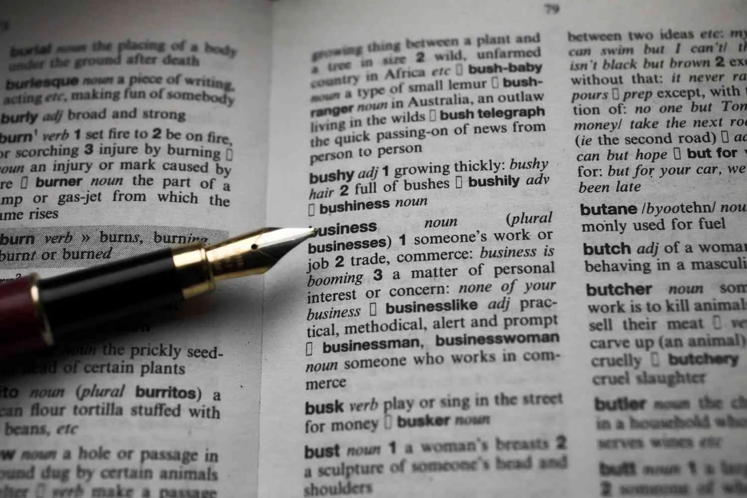
Book formatting directly dictates reader immersion, where poor layouts cause immediate eye strain and bad reviews, while professional formatting makes the design completely invisible so the story can shine. The impact differs significantly because Kindle relies on dynamic, user-controlled digital layouts, whereas print demands static, precision-engineered geometry.
The sections below outline how specific formatting choices impact the user experience across both mediums.
📱 Kindle & E-Readers: The Fluid Experience
Ebook layouts are reflowable, meaning the text flows and shifts seamlessly to adapt to any screen size or user preference. Poor digital formatting actively disrupts the device’s software capabilities.
- Typography Customization:
- The Impact: Forcing specific fonts or hardcoding fixed pixel sizes breaks the Kindle platform. Readers lose the ability to change fonts (like switching to OpenDyslexic) or adjust text sizing.
- The Fix: Use relative CSS units (like ems or percentages) so text scales smoothly based on reader choices.
- Navigation & Engagement:
- The Impact: Forcing readers to manually flip through hundreds of pages to find a specific section destroys digital engagement. Proper heading tags (H1, H2) boost navigation engagement by 34%.
- The Fix: Build a dynamic, hyperlinked Table of Contents (TOC) using standard paragraph styles.
- Layout Elements:
- The Impact: Using the “Tab” key for paragraph indents creates massive, random gaps on e-reader screens. Wrapping text around images breaks the code structure entirely.
- The Fix: Set clear first-line indents to exactly 0.2–0.3 inches via the paragraph style menu, and insert all images strictly inline.
- Layout Cleanliness:
- The Impact: Running headers, footers, and static page numbers create highly distracting text fragments floating in the middle of reading screens.
- The Fix: Strip out all headers and footers for the ebook file version.
📖 Print Books: The Tactile Geometry
Print formatting is permanent and unchangeable. Every single millimeter on the physical page must be carefully curated before exporting to a print-ready PDF.
- Physical Margins & Gutters:
- The Impact: If your inner margin (the gutter) is too narrow, the text gets swallowed by the physical book binding. Readers are forced to aggressively pull the book open, breaking the spine just to read the inner words.
- The Fix: Apply mirrored margins tailored specifically to your final page count.
- Visual Pacing & Air:
- The Impact: Setting lines too close together creates an exhausting “wall of text” effect. Setting them too wide makes the layout look empty, amateurish, and heavily inflates printing costs.
- The Fix: Set line spacing (leading) between 120% and 145% of your font size. Match a standard 11pt serif font with 13pt to 15pt leading.
- Cognitive Flow:
- The Impact: Widows and orphans (single lines left isolated at the top or bottom of a page) pull readers out of their sub-conscious reading flow.
- The Fix: Manually adjust line breaks and page boundaries to keep text bodies uniform. Ensure all chapters begin on a fresh, right-hand page.
- Text Cleanliness:
- The Impact: Left-aligned text creates jagged, messy right edges that look like an unedited draft. Sans-serif fonts strain human eyes over extended physical print reading sessions.
- The Fix: Use full justification for a clean block layout, paired with classic print-serifs like Garamond or Adobe Caslon.
⚖️ Side-by-Side Formatting Comparison
| Layout Element | Kindle / Ebook Standard | Print (Paperback/Hardcover) Standard |
| File Format | Responsive EPUB or KDP file | Fixed, print-ready PDF with embedded fonts |
| Text Alignment | Left-aligned (helps adapt to small screens) | Fully justified (creates sharp geometric columns) |
| Sizing Units | Relative sizes (percentages or em units) | Fixed absolute units (points and inches) |
| Page Layout | Fluid, continuous flow | Static pages with explicit trim sizes |
| Headers/Footers | Completely omitted | Included consistently (title, author, page number) |
| Table of Contents | Dynamic and hyperlinked | Static with physical page numbers |
Book formatting reader experience describes how typography, spacing, navigation, and page structure affect reading comfort. Good formatting lets Kindle text adapt to a screen and gives print pages a clear, steady rhythm. Poor formatting interrupts attention with broken chapters, crowded pages, weak contrast, or awkward page turns.
Those problems can make a sound manuscript feel unfinished. Moreover, a reader may blame the story or argument when the real problem is hard-to-follow presentation.
The solution is to format Kindle and print as separate products. Therefore, each edition should use the same content and visual identity while following the needs of its reading medium.
Key Takeaways
- Kindle books usually need reflowable text, linked navigation, and device testing.
- Print books need a fixed trim size, suitable margins, a readable gutter, and controlled page breaks.
- Fiction, nonfiction, and image-led books require different layout choices.
- Formatting should begin only after the manuscript and its structure are stable.
Why Does Book Formatting Reader Experience Matter?
Formatting matters because it controls how easily a reader can enter, follow, and return to a book. Clear chapter openings, consistent headings, and predictable spacing reduce small moments of confusion. In contrast, unexplained style changes make readers stop and work out what the page means.
Digital reading adds another need. According to the World Wide Web Consortium, EPUB normally reflows to the available screen, allowing changes to font size, line spacing, and word spacing. Therefore, an ebook should preserve meaning when a reader enlarges the type instead of trying to copy a printed page.
Print creates a physical reading path. A narrow gutter hides words near the binding, while oversized text creates frequent page turns. Therefore, type, leading, margins, and section breaks must work together.
What Changes Between Kindle Formatting and Print Book Layout?
Kindle formatting is flexible, while a print book layout is fixed. Therefore, an ebook formatter builds structure that reading software can restyle, but a print designer controls each line and page element.
These differences call for separate edition files. Authors can use Book Formatting Services to prepare a responsive ebook and a print-ready interior from one approved manuscript.
| Layout issue | Kindle edition | Print edition |
| Text flow | Reflows to the screen | Stays in a fixed position |
| Font control | Reader may change font and size | Designer sets type and size |
| Navigation | Linked contents and reading-system controls | Contents, page numbers, headers, and index |
| Images | Must scale on different screens | Must match trim, resolution, and bleed |
| Final testing | Kindle Previewer, phone, tablet, and e-reader | Print PDF, cover template, and physical proof |
Which Kindle Formatting Choices Matter Most?
The main Kindle formatting choices are reflow, semantic styles, navigation, and responsive media. Semantic styles label text by purpose, such as body copy, chapter title, or quotation. As a result, global changes stay consistent, and assistive technology can interpret the structure.
According to Amazon Kindle Direct Publishing, Kindle Create converts DOC or DOCX files into reflowable ebooks that permit text resizing on Kindle devices and free Kindle apps. Amazon also states that its interactive table of contents helps readers move between chapters. Therefore, heading detection should be checked instead of accepted without review.
A practical ebook formatting guide should include these checks:
- Apply paragraph and heading styles instead of tabs or repeated spaces.
- Add a linked table of contents with accurate chapter names.
- Use real text for tables when possible, not screenshots of text.
- Add useful alternative text to informative images.
- Preview small and large type settings in portrait and landscape views.
Fixed layout is the honest exception. For example, comics and picture books may depend on an exact link between words and art. However, fixed pages give readers less control over text presentation, so content needs should decide the format.
Which Print Book Layout Decisions Affect Comfort?
Print comfort depends on trim, margins, gutter, type, and page rhythm. Trim size is the page’s final width and height, while the gutter is the inside space beside the binding. Moreover, page numbers and chapter openings should guide without distracting.
According to Amazon KDP, 6 by 9 inches is its most common US paperback trim size. KDP explains that margins depend on page count and bleed. Therefore, files sent for book printing should use an interior PDF made for the selected trim, paper, binding, and print method.
Bleed means an image or background extends past the cut line. According to Amazon KDP, a 6-by-9-inch interior with bleed is set to 6.125 by 9.25 inches because 0.125 inch is added to the width and 0.25 inch to the height. However, body text should remain inside the safe margins.
What Formatting Mistakes Pull Readers Out of a Book?
The worst formatting mistakes break consistency or hide structure. Examples include manual tabs, random fonts, misplaced blank pages, stranded headings, isolated lines, and images that become unreadable on small screens.
Accessibility checks are part of quality control. According to the DAISY Consortium, EPUB review can include EPUBCheck for conformance and Ace by DAISY for accessibility issues. In addition, logical reading order, text resizing, contrast, and table structure should be tested before release.
Complex tables also need restraint. According to Amazon KDP, reflowable tables should usually stay below 100 rows and 10 columns, while tables with more than 1,800 cells or 20,000 characters are unsupported. Consequently, dense material may need smaller tables or lists.
When Should Formatting Begin?
Formatting should begin after developmental work, copyediting, and proofreading make the manuscript stable. Late rewrites can change pagination, chapter starts, contents, image positions, and print-cover spine width.
For that reason, authors should settle major story and structure questions first. The guide to developmental editing before self-publishing explains what that earlier stage examines. After that, the formatter can build clean Kindle and print editions without repeating settled work.
FAQs
Is Kindle formatting the same as print formatting?
No, Kindle formatting and print formatting solve different problems. A standard Kindle ebook reflows as the reader changes the screen or text settings. In contrast, a print interior fixes every line on a physical page and requires exact trim, margins, gutter, bleed, and pagination.
What is the best file format for a Kindle book?
EPUB is a common submission format for Kindle, although Amazon KDP also accepts other supported manuscript formats. However, the right file depends on the book. Text-heavy titles usually suit reflowable EPUB, while image-dependent books may require fixed layout and more device testing.
Why does an ebook look different on each device?
An ebook looks different because screen size, orientation, font choice, and reader settings can change the layout. Therefore, line endings and page counts may move. Sound ebook formatting protects heading order, paragraph structure, image behavior, and navigation instead of forcing identical pages everywhere.
Does print formatting affect the cover size?
Yes, the final interior affects a full print cover because page count, paper choice, and binding determine spine width. Consequently, the interior should be approved before the cover template is finalized. A change in type size or margins can alter pagination and require a new spine measurement.
Can an author format a book without professional help?
Yes, an author can format a straightforward novel with tools such as Microsoft Word and Kindle Create. However, complex tables, footnotes, illustrations, indexes, or several print editions raise the risk of errors. A careful author should still inspect a digital preview and order a physical proof.
Conclusion
Strong formatting makes reading feel natural in each medium. The book formatting reader experience improves when Kindle files reflow and navigate correctly, while print pages use suitable type, margins, gutters, and breaks. Canadian Ghostwriters can help authors prepare consistent digital and print editions once the manuscript is final.