
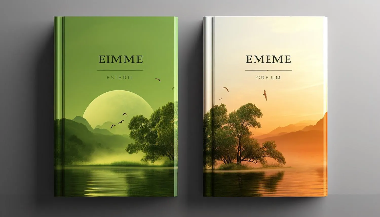
According to Amazon bestselling authors and book marketing experts, a great book cover acts as a high-converting billboard that dictates Amazon’s algorithm signals. On digital storefronts, a cover has roughly 0.2 seconds to capture a reader’s attention before they scroll past.
Bestselling authors focus on five foundational design rules to convert casual browsers into buyers:
1. Instant Genre Signaling
A cover must communicate its genre immediately through visual shorthand. If a cover misleads the reader, the book’s click-through rate (CTR) and sales will suffer.
- Thrillers: Feature darker palettes, high-contrast silhouettes, and aggressive, bold typography.
- Romance: Lean toward warm tones, soft pastels, and close-up character imagery or elegant script fonts.
- Fantasy/Sci-Fi: Focus on singular iconic symbols (like a sword or arcane emblem) or metallic, futuristic motifs.
- Literary Fiction: Favor minimalist, abstract layouts with artistic, thought-provoking imagery that implies depth.
2. Micro-Thumbnail Legibility
Because more than 80% of Amazon shoppers browse via mobile devices, a successful cover must remain perfectly legible at a postage-stamp thumbnail size.
- Keep typography large, bold, and sharply contrasted against the background layout.
- Avoid complex, muddy backgrounds that swallow text.
- Ensure the author’s name and main title stand out clearly even when scaled down.
3. A Single Focus Point
Cluttered covers fail on Amazon. Bestsellers rely on one dominant central image rather than trying to summarize the entire plot.
- Avoid cramming multiple characters, locations, and vehicles onto one canvas.
- Use one distinct, attention-grabbing object to create suspense or immediate curiosity.
4. Strategic Color Psychology
Because Amazon uses a stark white layout background, bestselling authors choose palette choices that pop against white space.
- Prioritize high-impact colors like deep blues, rich reds, and solid blacks to draw the eye.
- Use color to evoke the exact emotion the manuscript delivers—whether it is urgency, romance, or curiosity.
5. Balancing Familiarity with Distinction
The sweet spot for Amazon’s algorithm sits directly between comfortingly familiar and intriguingly different.
- Research current Top 100 bestsellers in your narrow sub-genre to mirror existing trends.
- Adopt the general layout structure your target audience expects, but inject one unique creative element to prevent your book from blending invisibly into the sea of competitors.
The great book cover elements in Canada are a clear genre signal, readable typography, one strong visual idea, and accurate Amazon formatting. Without those elements, a strong manuscript can appear confusing or amateur at thumbnail size. Therefore, the solution is a cover that promises the right reading experience before a shopper opens the product page.
Key Takeaways
- Match the genre’s visual language without copying another cover.
- Make the title readable in a small Amazon thumbnail.
- Build one clear focal point instead of showing every plot detail.
- Prepare separate eBook and print files.
- Test reader understanding before testing personal preference.
What makes an Amazon bestselling book cover work
A strong bestselling book cover tells the right reader what kind of book it is within seconds. According to Canva’s interview with bestselling author Mark Dawson, his priorities are genre tropes, typography, and thumbnail performance. In other words, beauty alone is not the test; clear communication is.
Specifically, genre cues include type style, color, imagery, and composition. For example, a thriller may use tight framing, while a business book may favor bold type. Authors can turn that positioning into a focused visual brief.
Which great book cover elements in Canada matter most
The key elements are genre fit, visual hierarchy, emotional tone, and legibility. Moreover, each should support the same reader promise. Canadian authors also need clarity across storefronts, devices, and print formats.
| Element | What it communicates | Strong approach | Common weakness |
| Genre signal | The shelf and reader group | Familiar cues with an original concept | Art that fits the story but not the category |
| Visual hierarchy | What the eye reads first | Title, image, and author name in a clear order | Several elements competing for attention |
| Typography | Tone and readability | One display face plus a simple supporting face | Decorative fonts that blur at small sizes |
| Focal image | Mood or central promise | One memorable object, place, or character | A collage of unrelated plot details |
| Series system | Connection between books | Repeated type, placement, and rhythm | Unrelated covers |
How do bestselling authors turn a story into one visual promise
They select the emotional promise rather than illustrate the full plot. According to Joanna Penn’s account of Pilgrimage, genre resonance and author branding guide the final direction. However, popular feedback can be wrong when a favored image misrepresents the book’s emotional truth.
That distinction matters during manuscript development. For instance, cozy mystery, psychological thriller, and romantic suspense each have different visual cues. Clear manuscript positioning makes the design brief more precise.
Why do typography and thumbnail size matter on Amazon
Typography must preserve the title’s reading order and mood at a small size. Mark Dawson’s Canva interview treats thumbnail viewing as a core test because browsers first encounter a reduced image. Therefore, a title that works only on a full paperback is not ready for an Amazon book cover.
First, a practical review shrinks the front cover to search-result size. Then the reviewer checks whether the title is readable, the genre is recognizable, and one focal point remains. Additionally, a debut author’s title often needs more prominence than the author name.
What Amazon KDP specifications affect cover quality
KDP specifications determine whether the design can be uploaded and printed as intended. According to Amazon KDP, the ideal eBook cover is 2,560 by 1,600 pixels, with JPEG and TIFF accepted. Consequently, an attractive concept still needs a correct file.
In addition, print covers require a full back, spine, and front spread. According to Amazon KDP, art must extend 0.125 inch beyond the top, bottom, and outside trim edges. Furthermore, KDP prints spine text only on books over 79 pages, so final pagination must precede spine production.
What should an author include in a cover design brief
A useful brief gives the designer market facts, not a chapter summary. According to Joanna Penn’s guidance, the author should state the genre and existing brand signals at the start. Specifically, the brief should contain these items.
- The exact title, subtitle, author name, and series name
- The primary genre, subgenre, target reader, and comparable covers
- A one-sentence emotional promise and a short synopsis
- Essential symbols plus images or scenes that should be avoided
- Required eBook, print, audiobook, and advertising sizes
- Revision limits, schedule, source-file terms, and image-license records
However, comparable covers are reference points, not templates. Instead, the designer should identify patterns such as type scale or framing, then create an original composition. This keeps the genre message familiar without imitation.
Which book cover design tips prevent common mistakes
The best book cover design tips remove confusion before adding decoration. According to Jane Friedman’s publishing guidance, a cover should align with successful books in its genre and subgenre. As a result, personal taste should not overrule the visual signals that help readers identify the shelf.
Common mistakes include weak contrast, too many fonts, unrelated stock images, and no thumbnail check. Additionally, a print wrap may fail when the spine is built before final pagination. Generative AI can support rough concepts; however, unclear image rights, visual errors, and generic output need careful review.
How should authors test a cover before publication
Authors should test comprehension first and preference second. Specifically, a useful test asks viewers to name the genre, tone, and first element noticed. If viewers admire the art but misidentify the book, the design has failed its main task.
Next, the team should inspect the thumbnail, full-size front, and printed proof separately. A proof exposes trim, color, spine, and barcode problems. After launch, eBook Social Media Marketing Services need square and vertical crops that preserve the title treatment.
FAQs
What are the most important elements of a great book cover
The most important elements are genre clarity, readable typography, one focal image, suitable color, and clear hierarchy. Together, they signal the reading experience. For Amazon listings, the title and main visual must remain understandable when the cover appears as a small thumbnail.
Should an Amazon book cover follow genre trends
Yes, an Amazon book cover should use recognizable genre cues without copying another title. Familiar type, imagery, and composition place the book on the right mental shelf. However, an original central concept helps the design remain distinct in search results.
What size should a Kindle eBook cover be
Amazon KDP recommends an ideal eBook cover size of 2,560 by 1,600 pixels. It accepts JPEG and TIFF files. However, authors should check current KDP guidance before upload because requirements can change, and the eBook cover should remain separate from the print wrap.
Can an author design a professional book cover in Canva
Canva can support a professional book cover when the user understands typography, licensing, hierarchy, and print setup. However, an unchanged template may appear generic or send the wrong genre signal. A designer is safer when the book needs custom art, a series system, or several editions.
When should a book cover be redesigned
A redesign is worth considering when readers misidentify the genre, the title fails at thumbnail size, or the series lacks a shared visual system. However, a new cover cannot guarantee sales because the description, reviews, pricing, sample, and audience targeting also affect conversion.
Finally, a cover should repeat the book’s promise across its Amazon listing, ads, social graphics, and series pages. Canadian Ghostwriters explains the book cover’s marketing role in more detail.
Conclusion
The great book cover elements in Canada combine genre recognition, clean hierarchy, emotional accuracy, thumbnail legibility, and correct KDP production. Bestselling authors such as Mark Dawson and Joanna Penn treat the cover as a reader promise, not a plot summary. Finally, Canadian Ghostwriters can help turn that promise into a clear brief and publication-ready design.